

Explore your essence
Phyto Parfums
Flora, part of Brazil's biggest conglomerate and owner of brands such as Albany, Francis, and OX, aimed to launch a new perfume brand focused on a young audience: Phyto Parfums.
In a category known for expensive, sculptural packaging, Phyto chose simple, standardized bottles, allowing it to offer high-quality fragrances at an accessible price of R$39.90.


J'adore
Phyto Parfums
In a price range where fragrances were either diluted or imitated, Phyto, with its concentrated and original formulas, had strong product differentiators. It was up to us to find a positioning and identity capable of connecting these differentiators to the yearnings of the young audience while also setting it apart from the rest of the category.
A compilation of existing studies on Generation Z showed that, having grown up without the pressure of being 'normal', this new generation sought above all the expression of their own identity, often fluid, since they did not feel the need to self-label.
We all have within us the desire to belong, but also the desire to be independent: two opposing desires.

An analysis of perfume industry communication revealed that, with messages of attraction and love, whether romantic or not, most brands have positioned themselves around the desire for belonging, with the lover as the archetype of the category.
Capitalizing on the target audience's trends, we saw an opportunity to align Phyto with a high-growth, less crowded motivational space. We defined its archetype as the Explorer, ready to discover scents and combinations, and, in the process, its own identity.

Positioning:


With the logo, created by the previous agency, already approved by the board, our challenge was to express the positioning only within the rest of the identity and in a way that harmonized with the existing name and symbol.
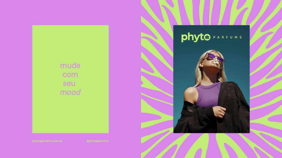
PP Studio, responsible for the design, created different leaf graphics, always with a fluid movement, as if floating on water.


The allusion to liquid movement also appeared in the text, in the combination of regular and italic letters.

Different colors and textures were created for each of the olfactory families, as well as texts alluding to the positioning.


Launched at Beauty Fair 2025, Phyto Parfums was very well received and is preparing to expand into physical stores.